Shaping a globally recognised fashion brand's digital presence through UX strategy, advisory brand leadership, and a scalable Shopify Plus architecture — acting not just as a designer, but as Head of Product Design and Brand & Product Design Director for the digital experience.
Role
Head of Product Design & Brand Design Director
Scope
Brand Direction, UX Strategy, UI Design, Shopify Plus Architecture
Platform
Shopify Plus · Web · Mobile
01 — The Opportunity
Rains is a globally recognised fashion and outerwear brand defined by its minimalist aesthetic, functional design philosophy, and Scandinavian heritage. As the brand expanded across regions, its UK digital experience needed to reflect not only product quality but also the elevated, design-led identity that defines Rains globally.
But the challenge extended well beyond UI or UX improvements. In many areas, the business lacked a fully defined digital direction or clarity on how the website should evolve. This created an opportunity to step in not just as a designer — but as a product and brand partner, helping shape the direction of the experience itself before a single component was placed on a page.
The digital experience did not consistently reflect Rains' minimalist identity — visual rhythm, hierarchy, and editorial tone varied across pages and touchpoints.
Drop-offs occurring in navigation and collection browsing pointed to an information architecture misaligned with how customers actually think about the range.
Dominant mobile-first usage patterns were not matched by the experience — a significant conversion gap between mobile traffic and mobile revenue.
Stakeholders held differing views on what the digital experience should achieve — creating ambiguity in prioritisation, content hierarchy, and product focus.
02 — Discovery
The discovery phase combined quantitative behavioural analysis with qualitative research and strategic stakeholder alignment — in that order. Before any UX decisions, I facilitated brand and product workshops to define digital positioning, customer expectations across markets, commercial priorities, and future scalability requirements. These sessions were critical: stakeholders who initially held differing visions left aligned around a shared direction.
Quantitative analysis — across Google Analytics, heatmaps, scroll tracking, and conversion funnel data — identified the where: drop-offs in navigation, underperforming high-value categories, and a mobile experience that was losing customers before they reached a product page. User interviews and competitor benchmarking answered the why: customers expected the same level of editorial restraint and product confidence from the website that the physical product delivered. The gap between the two was costing conversion.
03 — Strategy
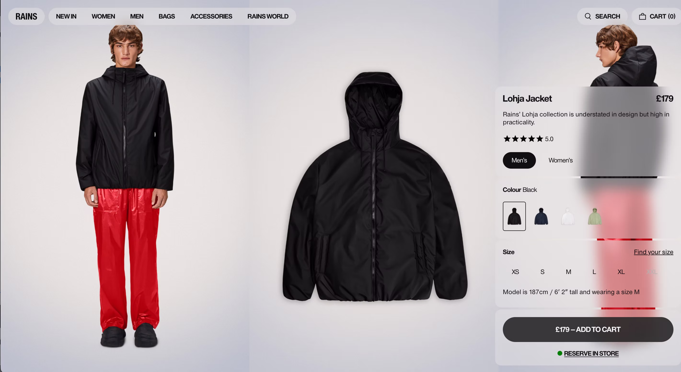
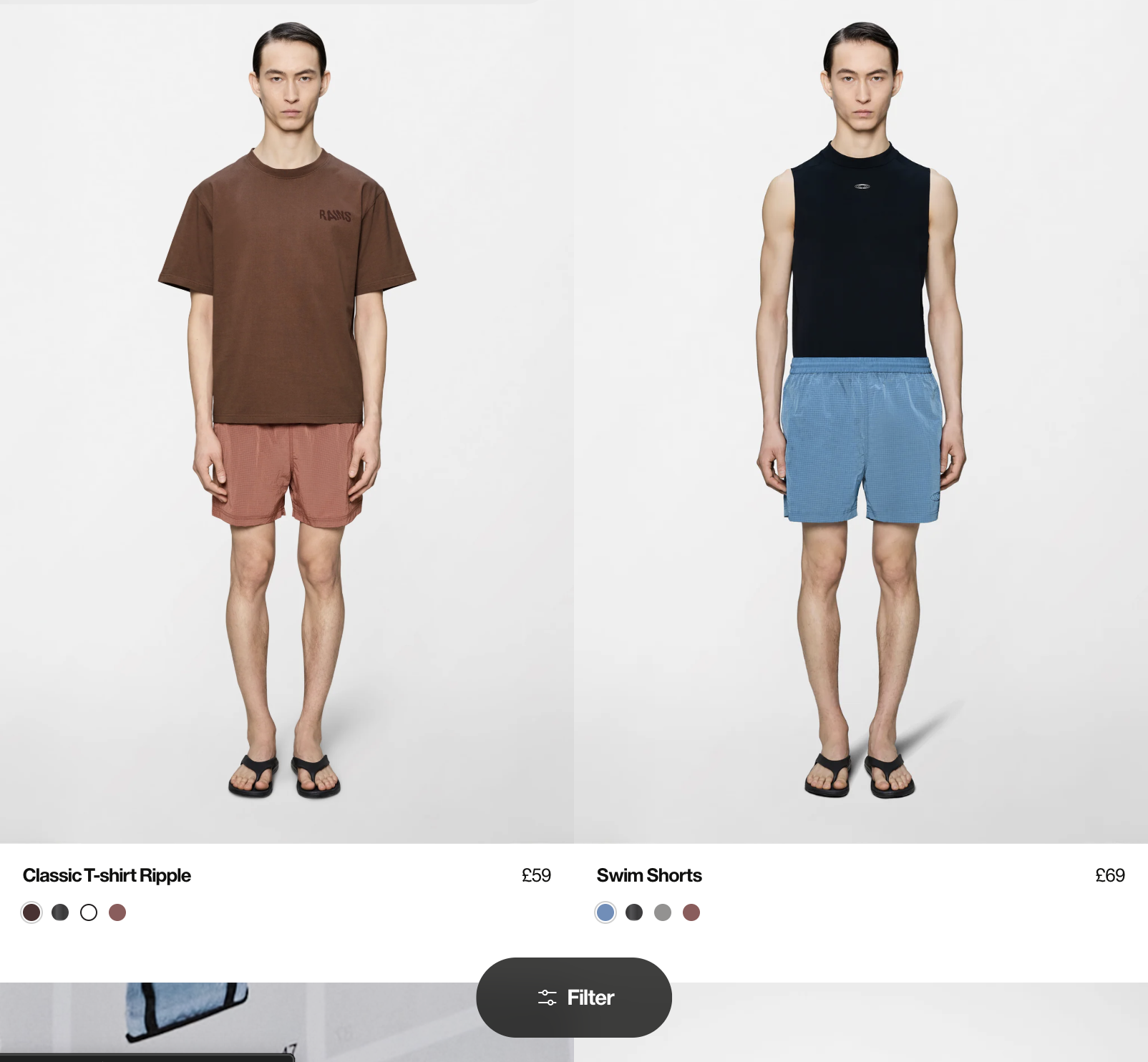
From the combined research, I defined a unified strategy across brand, UX, and commercial performance. The first pillar was establishing a premium digital brand experience — a structured experience framework built around strong editorial storytelling, minimal but intentional UI, clear product hierarchy, and a consistent visual rhythm that felt unmistakably Rains.
The second pillar was navigation and discovery: a redesigned information architecture that simplified exploration, reduced cognitive load, and moved users seamlessly from inspiration to purchase. The mega menu was optimised, collection grouping logic refined, and filtering made genuinely useful rather than ornamental.
Mobile-first was the third pillar — not a constraint but a discipline. Thumb-friendly navigation, simplified browsing journeys, and prioritised content hierarchy were designed for mobile first, then expanded for desktop with richer editorial depth. The fourth pillar ran through every decision: CRO. Stronger product page hierarchy, clearer CTA placement, improved trust signals, and a streamlined path to checkout.
04 — Brand Direction
A defining characteristic of this project was the elevated scope of the role. Where direction was unclear, I didn't wait for a brief — I helped create one. That meant facilitating sessions to define what premium e-commerce should feel like for Rains, how the brand should visually behave in digital environments, and how storytelling and commerce should coexist without one compromising the other.
In several project areas, my contribution was advisory leadership — translating ambiguous business intentions into structured product decisions. Teams moved from loosely-held ideas to clearly defined UX solutions with rationale grounded in both user needs and commercial objectives. This shift — from designer to director — is what allowed the project to maintain a coherent vision across a complex, multi-stakeholder environment.
05 — Design System & Collaboration
To support long-term growth, I built scalable design principles and reusable components across the Shopify Plus ecosystem. Working closely with developers from the start — not at handover — ensured every design decision was technically grounded and every Shopify Plus capability was considered before it shaped the design approach.
The system that shipped was consistent across all pages and templates, faster to extend for future features, and aligned with the requirements of international expansion. Strong design-development alignment throughout meant the final experience remained true to the product vision, not a compromised approximation of it.
06 — Outcome
The redesigned Rains UK experience delivered a more cohesive, scalable, and conversion-focused digital platform that genuinely reflects the brand's premium positioning. Stronger alignment between brand identity and digital experience. Improved product discovery and navigation flow. A more consistent mobile-first shopping journey. And a Shopify Plus architecture built to scale internationally.
The numbers followed: +32% conversion rate, +44% time on site, and –28% basket abandonment — all within the first two months post-launch. But the more significant outcome was structural: Rains left with a design system, a clear digital brand language, and a team aligned on what premium e-commerce should feel like for them. That clarity is what makes future growth possible.
Key Learning 01
When stakeholders are misaligned, no amount of good UX execution will produce a coherent experience. The most valuable design work sometimes happens before a single screen is designed.
Key Learning 02
Premium fashion brands demand that digital experiences earn the same trust as their products. That trust comes from consistency, restraint, and editorial confidence — not from adding more.
Key Learning 03
The difference between a good designer and a strategic partner is the willingness to structure ambiguity. Bringing clarity to unclear briefs is itself a design output — often the most impactful one.
"Paria understood our brand immediately. The new experience feels completely in line with who we are — premium, considered, and effortless. Beyond the design itself, she helped us understand what we needed before we knew how to ask for it."— E-commerce Director, Rains UK
Next project
Land Rover & Jaguar — UX Architecture →If your brand needs someone who can bring strategic clarity to a digital experience — not just design it — let's talk about what that partnership could look like.
Start a conversation →